Dani Ventura
Design
Design
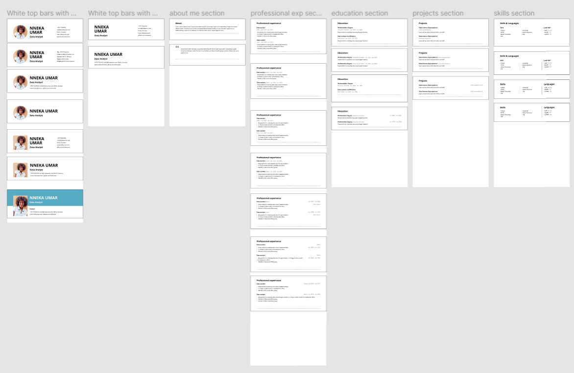
Design CV templates for the MVP of a job-seeking platform aimed at ReDI students transitioning into the tech job market.
Three CV templates (minimal, modern, stylish) validated with recruiters and handed off for development as part of the MVP.