Dani Ventura
Design
Design
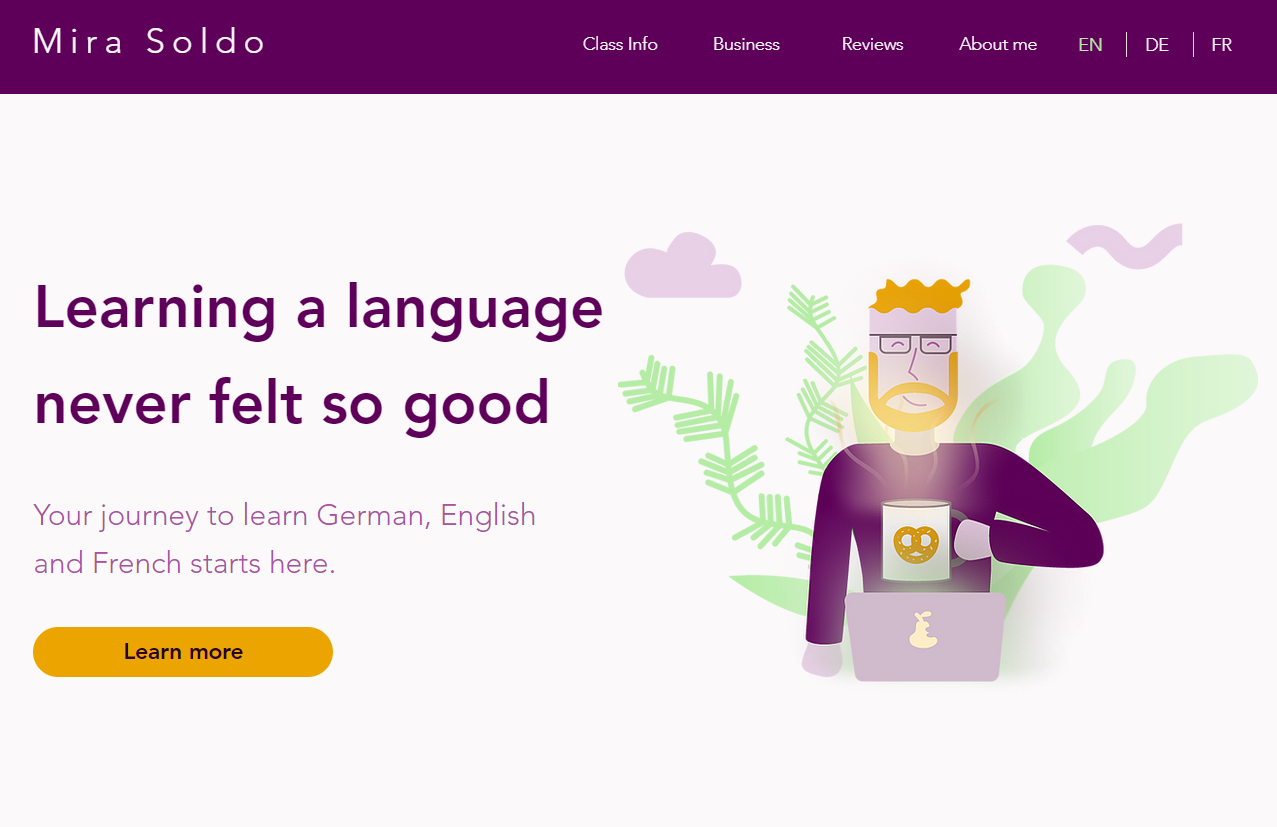
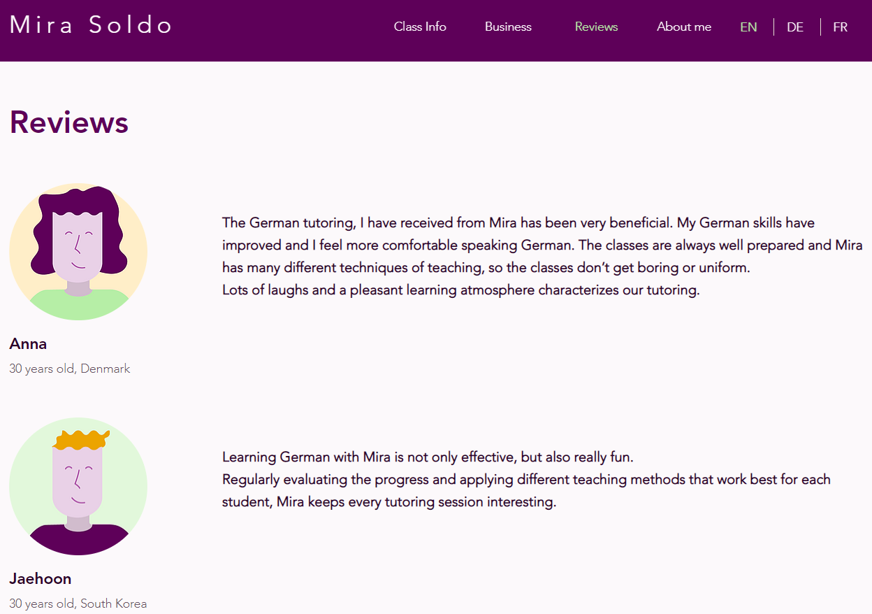
Present a language teacher as a credible and human alternative to traditional language schools, while allowing full autonomy over future updates.
A fully responsive website that increased the client’s online visibility and positioned her personal approach as a key differentiator.